
CASE STUDY
Beginning.com
Designing a Digital Sanctuary for Women's Wellbeing
Beginning.com is an all-in-one health app for women that supports them with transformative sound therapy, intelligent period & pregnancy tracking, and personalized care.
Industry: Women's Wellness, Mental Health
Project Scope:
Brand Identity
UI/UX Design for App and Website
AI-Powered Illustration Generation
Art Direction
5.0
AppStore Rating
100%
5 Star Reviews
100M+
Minutes Streamed
5.0
AppStore Rating
100M+
Minutes Streamed
100%
5 Star Reviews
CASE STUDY
Beginning.com
Designing a Digital Sanctuary for Women's Mental Wellbeing
Beginning.com is an all-in-one health app for women that supports them with transformative sound therapy, intelligent period & pregnancy tracking, and personalized care.
Industry: Women's Wellness, Mental Health
Project Scope:
Brand Identity
UI/UX Design for App and Website
AI-Powered Illustration Generation
Art Direction
Project Overview
Beginning.com set out to create the most advanced, all-in-one women’s wellness app in the world — a safe, elegant, and empowering digital space guiding women through every life stage: period, fertility, pregnancy, postpartum, and menopause.
They came to Ascend Creative with nothing but a bold idea and an ambition to rival the likes of Flo and Clue — but with a crucial difference:
They wanted beauty, depth, and emotional intelligence woven into every pixel.
-PORTFOLIO-

The Goal
The women’s health market was saturated with apps offering functionality, but little soul. Flo, Clue and other well established brands delivered the basics, yet their visual design felt plain, lacked emotion and their UX was uninspiring. Beginning.com wanted to break the mold with an app that:
Felt like a dream in your hands.
Delivered science-backed sound therapy to ease pain and emotional strain.
Supported every stage of womanhood with tailored, deeply personal experiences.
Looked and felt premium — a wellness app women would love to use daily.
Our Roles
We were entrusted with everything from the ground up:
Brand Identity – Logo, typography, color palette, iconography, and visual language.
App UI/UX Design & Strategy – Every screen, interaction, and feature flow.
Website Design – A multi-page marketing site mirroring the app’s tone.
Generative AI Art – Custom ethereal imagery for the website, some of the sound journeys and brand visuals.
Art Direction – Guiding their in-house team within the visual and design related aspects.
The Beginning.com team handled product ideation, project management, and app development; we transformed it into an elegant, intuitive, and emotionally intelligent experience.

UX Philosophy
Designing With Empathy and Curiosity
Designing a women’s wellness app as male creatives required much more than technical skills — it demanded deep empathy and the ability to step into women's world entirely. We spent days analyzing women’s apps, studying color psychology, and decoding the subtleties of feminine design aesthetics. But our most valuable work happened in collaboration — working hand in hand with women, listening with open hearts and minds. We consciously set aside our ego, replacing it with genuine curiosity and an open mind.
Through ongoing conversations, feedback loops, and observing emotional reactions, we learned how trust, beauty, and clarity must coexist in a women's wellness product. Every detail — from typography to transitions — was crafted to feel like a supportive presence in her daily life.
Our guiding principles:
Gentle, intuitive interface that doesn't over- or underwhelm.
Glassmorphism for lightness and depth, allowing artwork to breathe.
Emotional resonance in every interaction — the app should feel like a caring friend.
The result is Beginning.com — a brand and app shaped by fully embodying the perspective of the women it serves.


Brand Identity
Beginning.com needed a brand identity that could carry both medical credibility and emotional resonance — a bridge between science and soul. We designed nine logo concepts before settling on the minimalist butterfly that resembles an infinity loop — a symbol of transformation, freedom, and continuity. This emblem became the visual and emotional anchor of the brand. We designed multiple logo variations to ensure adaptability across mobile, print, and digital campaigns.
-PORTFOLIO-
Color Palette
Colors were carefully tuned to elicit calm confidence: soft pink for compassion, light indigo for wisdom, and airy neutrals for balance. These hues were complemented by refined typography — humanist sans-serifs for accessibility, paired with delicate serifs for authority.
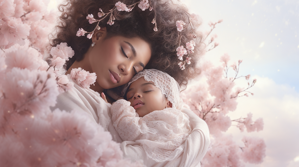
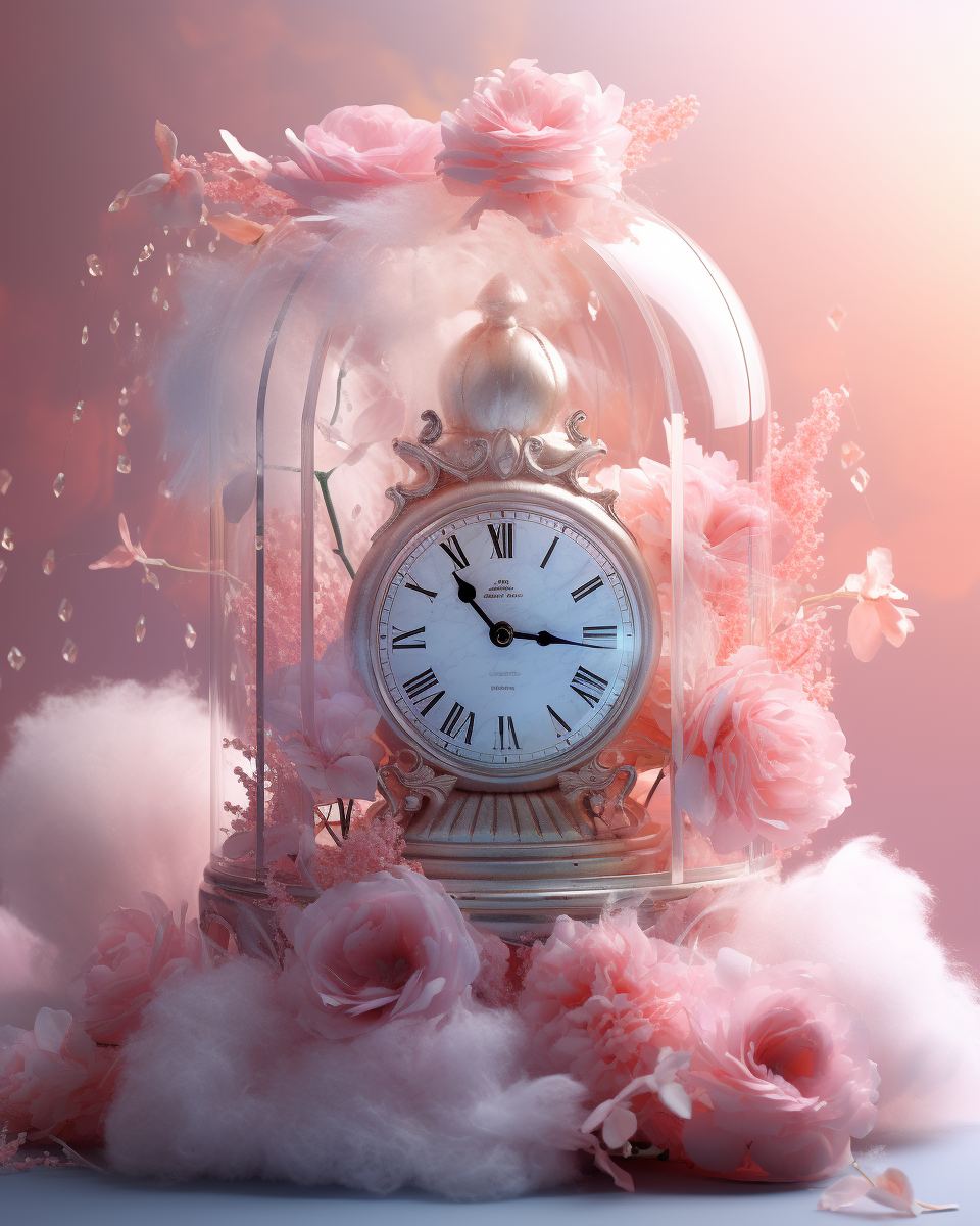
Visual Aesthetics
Our AI-assisted illustrations added depth, portraying soft pastel gradients and flowing textures that echo the emotional landscapes women navigate. Cherry blossom trees, fluffy clouds and snug furry textures evoke a gentle feminine, nurturing essence. These became signature backdrops for the app, website and marketing visuals.
Every detail was a strategic choice — creating an identity that’s as precise as it is poetic and magical, ensuring users feel both cared for and empowered.


-PORTFOLIO-
Main Features
The features we designed for Beginning.com go beyond utility — they’re crafted to evoke a sense of calm, empowerment, and confidence. By combining mindful UX with a visually soothing interface, we turned essential wellness tools into an elegant user experience that supports women daily.


3D Sound Journeys
Designing the UI for the 3D Sound Journeys was like painting with light, space, and emotion. Every pixel was part of an intentional choreography to dissolve the barrier between the user and sound.
We crafted the UI as a portal, not just a media player — a warm invitation to step into a multi-sensory space.
Used ethereal imagery and light, soft gradients, to mirror the calming rhythm of sound therapy.
A translucent glass-effect interface that creates dimensional depth, showcasing the artwork while allowing it to breathe and flow with grace.
Period/Fertility Tracker
The Period & Fertility Tracker was one of the most strategically and emotionally complex features we designed. Our challenge: take one of the most common, utilitarian tools in women’s health apps and transform it into something extraordinary — something that feels alive and deeply personal.
As the user enters, butterflies gracefully fly away from the flower circle — a poetic, unexpected detail that instantly creates delight and emotional connection.
A circular composition at the center anchors the key dates and data, ensuring clarity at a glance.
Surrounding it, seasonally evolving flowers shift in color and form, mirroring each phase of the cycle.
We designed it as a ritual of self-connection, where every glance offers reassurance, beauty, and a reminder of the elegance of one’s own natural cycle.


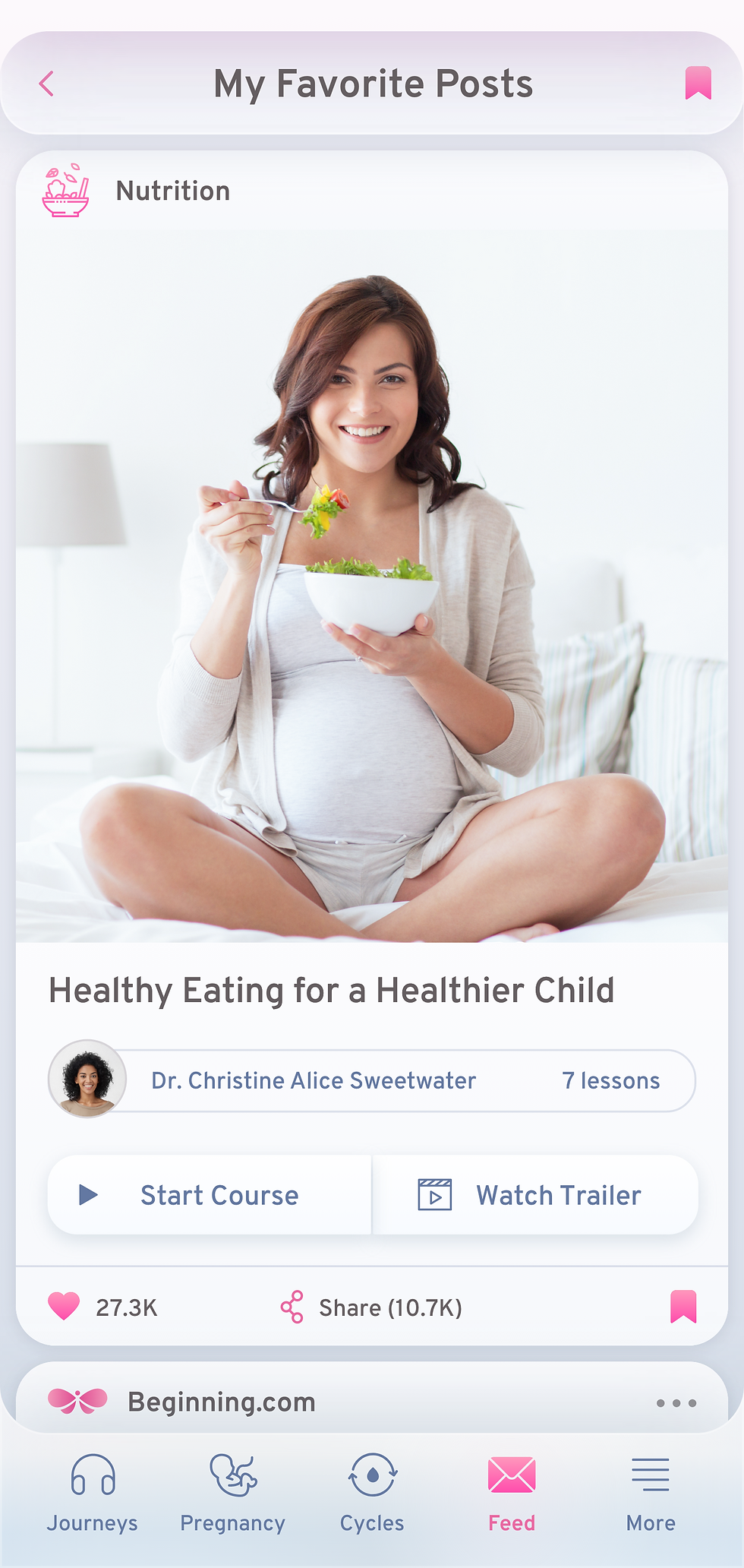

Wellness Feed
The Wellness Feed was conceived as a personal sanctuary of curated wisdom, tuned to each woman’s unique cycle, emotional state, and life stage. Our design objective was to make the feed feel like a trusted friend who knows what you need, before you know it yourself.
Intelligent curation: Content relevance is tied to the user's main goal, interests, her natural cycle and wellbeing, making the feed feel almost clairvoyant.
Visual rhythm: Alternating content formats and sizes to keep the eye engaged and the mind curious.
Soothing aesthetics: Light pastel tones and curved edges give the content blocks a friendly and safe feeling.
Every scroll is an act of self-care, designed to leave the user feeling lighter than when she arrived.
Pregnancy Tracker
While researching competitor apps, we saw the same pattern — static images paired with brief descriptions. Functional, but uninspiring. We set out to create a pregnancy tracker that feels alive, is emotionally resonant, and truly interactive. In order to achieve that we implemented a soothing soundscape and an immersive 3D model of a fetus that:
Floats in space, symbolizing women as cosmic portals for new souls coming to Earth
Grows in real time according to pregnancy stage
Moves naturally, simulating lifelike motion
This approach not only enhances the visual engagement but also deepens the emotional connection between the mother and child.


More Screenshots


Scroll Left

"Working with Ascend Creative is like working with your best friend - fun and effortless. And their attention to details is remarkable!"
Beginning.com Team


Reflection
Beginning.com is more than an app — it’s a love letter to womanhood. For Ascend Creative, it proved our ability to blend visionary design, emotional intelligence, and technical precision into one seamless product.
Our goal was to go beyond designing a wellness app — we wanted to give women a digital sanctuary where they could really feel supported, understood, and empowered through every stage of their life — and all this, while being immersed in ethereal beauty — an app that speaks to their soul, not just their mind and body.

Want to Create Something Like This?
Share your ideas with us and let's discuss how we can bring your vision to life and launch it to the market. Today's technology allows us to build even the most innovative ideas faster and easier than ever before. We live in a world of endless possibilities. Let's create something meaningful together!
Our Core Value
Collaboration
“Your Vision, Our Craft.”
We work hand-in-hand with you, ensuring, that everything reflects your vision and goals.
Creativity
“Inspired by Imagination”
We push boundaries to create designs that are fresh, innovative, and unforgettable.
Purpose
“Every Pixel Has a Mission.”
From colors to layouts, each choice is intentional, to align with your brand’s mission and your user's aspirations.
Clarity
“Less Noise, More Impact.”
We strip away distractions to create clean and simple user experience that amplifies your message.