
— Case Study
Beginning.com
Designing a coherent brand and digital experience for women’s wellbeing
Beginning was developed as a multi-feature wellbeing app for women, bringing immersive sound journeys, fertility and period tracking, pregnancy guidance, and wellness content into one digital product.
Project Scope:
Brand Identity
UI/UX Design for App and Website
AI-Powered Illustration Generation
Art Direction

/ The Context
Many Different Layers of Wellbeing IN ONE PRODUCT
Beginning was conceived as a broad digital wellbeing environment for women rather than a single-purpose app.
The product brought together experiences with very different interaction needs: immersive sound journeys, editorial wellness content, period and fertility tracking, pregnancy and post-partum guidance.
The underlying product concept, feature set and positioning were defined by the founders. My responsibility was to turn that vision into a coherent visual and digital experience.
What made the project interesting was not simply the number of features, but making them feel like parts of one recognisable product, rather than four unrelated tools living inside the same app.
/ The Challenge
Making Complexity Feel CLEAR AND CoheSIVE
Each part of Beginning asked something different from the interface.
Sound Journeys needed atmosphere and emotional depth
Fertility tracker needed to communicate dense cyclical information quickly and clearly.
Wellness Feed & Courses needed familiar content hierarchy to social media feeds.
Pregnancy tracker had to balance practical information with a more personal emotional context.
The challenge was to give each feature the interface it needed without losing the sense that everything belonged to the same product.


Three principles shaped the work:
Clarity before decoration
Functional information had to remain easy to understand, even when the surrounding visual world became expressive.
Consistency without sameness
Shared navigation, spacing, typography and interaction patterns created continuity while individual features retained their own character.
Emotion with purpose
The visual system was designed to make Beginning feel softer and more human without allowing atmosphere to interfere with usability.
— Role & Scope —
Working across product, identity and visual direction
Beginning was a long-term engagement (beside MindSpa) that evolved through many iterations between November 2020 and March 2023.
I was responsible for designing the complete mobile interface and user experience across the major product features, creating the original visual identity and logo, designing the initial multi-page website interface, and helping establish the broader visual world around the product.
I worked directly with the founders and development team throughout implementation, using Adobe XD and Zeplin for design and handoff, Jira for development coordination, and regular weekly meetings to review progress and refine the product.
I also art-directed two in-house designers to help maintain consistency as the amount of visual and product work expanded.
Visual Identity
original Beginning logo and visual identity.
Mobile UI/UX
complete interface design across iOS and Android product experiences.
Web UI
Initial multi-page Beginning.com website design, developed by the client’s development team.
Design Collaboration
Ongoing developer handoff, iteration and direction across a multi-year product cycle.
Visual Direction
Art direction and development of the soft, surreal visual language used across the digital experience.


/ UX Approach
ACIEVING Clarity Across Very Different Experiences
Because the feature strategy was already defined by the founders, my role was not to reinvent what Beginning did. It was to determine how those features should behave and coexist as an interface.
The product needed enough flexibility to support very different kinds of interaction without asking the user to relearn the experience each time they moved between modules.
Familiar patterns where familiarity helps
Core navigation and interaction patterns remained intentionally recognisable. Novelty was reserved for moments where it improved the experience rather than simply making the interface feel different.
Hierarchy before density
Information-heavy features were structured around clear primary states, with secondary information placed around them rather than competing for equal attention.
Emotional continuity
Typography, spacing, color, navigation and recurring visual patterns connected features that otherwise had very different functional requirements.
Progressive complexity
The most important information was designed to be understood first, with additional detail available as the user moved deeper into each feature.
/ Product System
Different features.
SAME interaction language.
A large part of the work involved establishing enough shared structure that Beginning could grow without every new feature becoming its own isolated design exercise.
Common navigation behavior, typography, spacing, button logic, cards, content hierarchy and recurring interface patterns created the foundation.
Individual modules could then change visually according to their purpose without losing the underlying product language.
This balance became particularly important because Beginning moved between two very different modes:
functional experiences, where clarity and information hierarchy were primary, and immersive experiences, where visual atmosphere could play a much larger role.
The system needed to support both.


/ Visual Identity
A Softer, FEMININE Aesthetic For Digital Wellbeing
The founders had already defined Beginning’s positioning and messaging. My role was to create the visual identity that could express that direction across the product.
The identity was intentionally light, feminine and emotionally warm, using soft forms, generous whitespace and a restrained pastel palette to create distance from the colder visual language common in health and tracking products.
Rather than building the identity around a large number of decorative brand elements, the system relied primarily on typography, color, imagery and the interface itself.
Logo
The Beginning mark was designed to feel simple, contemporary and gentle enough to sit comfortably across both functional and emotionally expressive environments.
Colors
Soft pinks, pale blues and neutral surfaces formed the primary product environment, while deeper rose, plum and atmospheric tones were introduced where individual experiences required greater immersion.
Interface Expression
Brand identity and product design were treated as one connected system. The same visual principles carried from the identity into buttons, navigation, cards, imagery and screen hierarchy.
/ Art Direction
Building a Recognisable Emotional World
Beginning needed imagery that felt more distinctive than generic wellness stock photography.
The visual direction developed around softness, nature, surreal space and an intentionally dreamlike sense of escape. Clouds, blossoms, human figures and imagined landscapes became recurring motifs, giving the product a recognisable atmosphere across multiple experiences.
The goal was never surrealism for its own sake. The imagery was used to signal emotional state.
Lighter environments supported calm, openness and everyday wellbeing. Darker and more immersive visual worlds were used where the experience itself became more introspective or sensory.
/ Visual Principles
Soft, not clinical
The imagery deliberately avoided the sterile language of conventional health technology.
Surreal, but emotionally legible
Even imagined environments retained familiar human and natural anchors.
Flexible within one world
Individual features could feel distinct without abandoning the same overall palette and visual grammar.
Atmosphere supporting function
Illustration never replaced product hierarchy. It surrounded and reinforced the experience.


/ Visual Production
Art Direction Beyond a Single Image
Part of the visual system was produced through AI-assisted image creation under a defined art direction rather than through isolated generations.
Consistency came from repeatedly controlling the same variables: palette, softness, natural motifs, human presence, composition and emotional tone.
This made it possible to create different visual environments for different parts of the product while maintaining enough continuity for them to feel recognisably Beginning.
The tool was part of the production process. The system and creative decisions around it were the design work.




— Product Experience —
One System Across Very Different User Needs
The breadth of Beginning becomes clearest at feature level.
An audio player, a fertility tracker, an editorial feed and a pregnancy experience each demand different kinds of interface behavior.
The following examples show how the shared product language adapted around those different needs.


/ 01 · Immersive Audio
3D Sound Journeys
The Challenge
Sound Journeys were intended to feel more immersive than a conventional audio library, but the atmosphere could not come at the expense of familiar playback behavior.
The Design Response
Discovery was led visually, allowing each journey to establish an emotional tone before playback began.
Once inside the listening experience, familiar controls remained easy to identify while the surrounding interface became darker and more atmospheric.
The result was a module with a noticeably different emotional character that still behaved like part of the same product.
/ 02 · Tracking
Period/Fertility Tracker
The Challenge
Cycle tracking carries substantially more information than an immersive content experience. Dates, phases, fertility states and daily status all compete for attention if the hierarchy is not carefully controlled.
The Design Response
The interface uses a circular model that reflects the cyclical nature of the underlying information.
The most important current state sits at the centre, while secondary information is distributed around it through color, labels and supporting data.
This allowed users to understand their current position quickly without exposing all available information at the same visual level.



/ 03 · Content
Wellness Feed
The Challenge
The content experience needed to accommodate different subjects, authors and recommendations without becoming a generic stream of equally weighted cards.
The Design Response
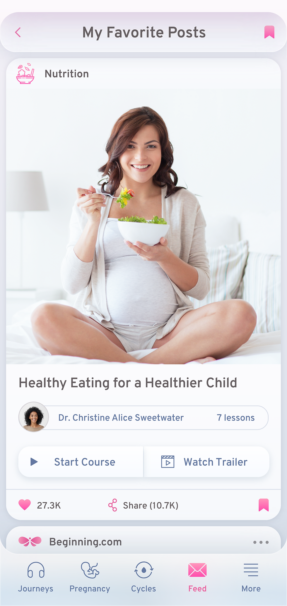
Clear content hierarchy separates primary recommendations from supporting stories while familiar feed patterns keep browsing intuitive.
Photography provides emotional context, while typography, metadata and repeated card structures create enough consistency for users to scan quickly.
The feed therefore feels editorial without losing the efficiency expected from a mobile content interface.
/ 04 · Guidance
Pregnancy Tracker
The Challenge
Pregnancy tracking combines practical information with a subject that can carry much more emotional weight than ordinary health data.
The experience therefore needed to communicate progression clearly without becoming overly clinical.
The Design Response
Stage-based information remains structured and easy to navigate, while more intimate visual content creates an emotional layer around the functional data.
The same core interface principles remain intact, but the visual world adapts to make progression feel more personal and meaningful.


— Brand Implementation —
Exploring How The Identity Could Extend Beyond The Screen
The physical applications shown here were created as conceptual brand extensions, exploring how the identity could translate into a broader wellbeing ecosystem through packaging, journals, audio products and selected lifestyle touchpoints.


— Design Outcome —
A unified product language across a broad wellbeing experience
Over the course of the engagement, Beginning developed from a new product idea into a complete digital experience with its own visual identity, mobile interface system and website.
The design work established:
A complete original visual identity
A consistent visual foundation for the first Beginning product direction.
A unified mobile experience
One interface language spanning immersive content, editorial experiences and information-heavy tracking tools.
A scalable visual system
A recognisable art direction capable of adapting to different emotional and functional contexts.
A connected web presence
A multi-page website interface translating the same product and identity language beyond the app.
The product launched publicly on iOS and Android in March 2023
Its commercial adoption ultimately did not develop as the company had expected, and they later changed their marketing direction substantially, turning the whole Beginning experience into an online course, where the app is one part of the journey. The identity, website and product direction shown in this case study were eventually replaced. Therefore this case study represents the design work completed for the original Beginning product, not the brand in its current form.

Working with Rivo is like working with your best friend - fun and effortless. And his attention to details is remarkable!


/ Reflection
What Beginning Taught Me
Beginning was one of the projects that pushed me furthest across disciplines.
Designing a product with such different functional and emotional modes reinforced something I still believe strongly: clarity and character are not opposites.
A product can be expressive without becoming difficult to use, and functional without becoming emotionally flat. The stronger the underlying system becomes, the more freedom there is to create meaningful variation on top of it.
The project also taught me the value of continuity. Working on the same product over several years meant seeing decisions survive implementation, evolve through feedback and affect completely different parts of the experience.
That perspective continues to shape how I approach brand and digital work today.