
— Case Study
MindSpa
Redesigning MindSpa for Its Next Stage
MindSpa is a mental wellbeing app built around immersive audio experiences, personal reflection tools and an evolving content ecosystem.
I was part of the rebranding of Europe's largest mindfulness app, Synctuition, into MindSpa.
Project Scope:
Mobile App UI/UX Design
Website Design
Partial Brand Identity Redesign
AI-Powered Illustration Generation
Art Direction

/ The Transformation
When the Product Outgrows the Experience
MindSpa (formerly Synctuition) was evolving beyond its original sound-based experience. New content formats, personal reflection tools, diagnostic-style interactions and broader wellbeing features were steadily expanding what the current product was able to do.
As the feature set grew, the design challenge changed. Individual screens could no longer be treated as isolated solutions. Navigation, hierarchy, content discovery, playback and personalisation had to begin working as parts of one larger product system.
My role was to rethink that experience from the inside out, creating enough structure to make the product easier to understand today while keeping it flexible enough to accommodate what might come next.
/ The Challenge
Growing Complexity.
One Unified Experience.
The challenge was not a shortage of ideas. It was creating enough coherence for an ambitious product that kept evolving.
Over the course of the engagement, MindSpa expanded across several different types of experiences: immersive audio journeys, personal wellbeing indicators, content feeds, assessments, background listening and supporting materials.
Each area had its own interaction needs, but the app still had to feel like one product.


Growing complexity
New functionality needed to fit into the existing experience without making navigation or hierarchy progressively harder to understand.
Maintaining coherence
New screens and features had to feel related to one another even when their purpose, content density and interaction patterns were very different.
Designing for what came next
The system needed enough discipline to remain recognisable, but enough flexibility to support functionality that had not yet been defined when the redesign began.
Role & Scope
Working across product, identity and visual direction
The transformation was not only about visual change but more about improving how the entire product worked together.
Before
A growing collection of features
Interaction patterns evolving independently
Increasing navigation and content complexity
New functionality requiring repeated design decisions
Visual consistency becoming harder to maintain
After
Shared interaction patterns across related features
A more modular and reusable interface system
Clearer hierarchy across content-heavy experiences
Consistent navigation and playback behaviour
A stronger foundation for future product development
The result was a product that could continue evolving without every new feature becoming a new design problem from scratch.
Product System
Different Functions.
A Shared Logic.
As MindSpa expanded, the interface had to support very different behaviours without becoming fragmented. Each core feature was designed around its own purpose while sharing the same navigational, visual and interaction logic.

Sound Journeys
A layered discovery and playback experience designed to make a growing library of immersive audio content easy to browse, understand, save and continue across sessions.
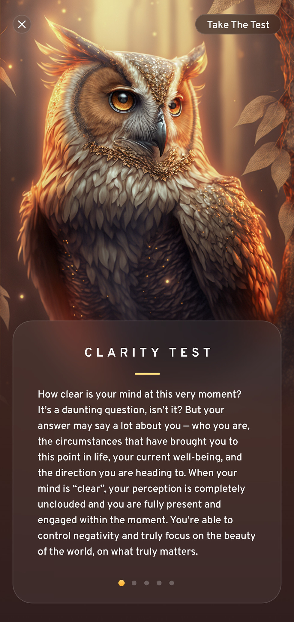
Clarity Test
A guided self-reflection flow designed to make a longer questionnaire feel focused and approachable, with clear progression and an experience consistent with the rest of the product.

My Clarity
A personal dashboard bringing multiple self-reported wellbeing indicators into one structured overview, making a relatively data-heavy experience easier to scan and revisit over time.

Positivity Feed
A flexible content stream combining messages, articles, video and inspirational material while maintaining the visual rhythm and navigation logic of the wider app.


/ 01 · Sound Journeys
Designing the Journey Beyond the Playlist
Sound Journeys were one of MindSpa's core experiences, but the interaction extended far beyond choosing an audio track. Users needed to browse themed journeys, understand their structure, move between levels, return to previously explored content and transition naturally into playback.
I developed the journey library and player as one connected flow rather than separate screens. Information hierarchy, progress, favourites, playback controls and supporting content were progressively refined so that discovery could remain visually rich without making the experience difficult to navigate.
The playlist and player were also among the interaction patterns shared with Beginning.com. Because both products evolved in parallel, improvements developed in one could expose weaknesses or opportunities in the other. Over several iterations, the shared mechanics became clearer and more robust while the visual expression remained specific to each product.
/ 02 · Clarity Test & My Clarity
From Reflection to a Scannable Personal Overview
The Clarity experience introduced a very different UX challenge from the immersive audio content. Instead of browsing and listening, users were asked to reflect on a series of personal questions and then make sense of the resulting information.
The challenge was to prevent a relatively complex flow from feeling clinical or overwhelming. I structured the assessment around clear progression, focused one-step-at-a-time interactions and a restrained visual hierarchy that kept attention on the current question.
The resulting information then fed into My Clarity, where multiple indicators had to become understandable at a glance without reducing the experience to a conventional analytics dashboard.
The interface therefore balanced structure with warmth: clear category hierarchy and progress indicators on one side, and the more atmospheric MindSpa visual language on the other.


/ 03 · Positivity Feed
Designing a Feed That Could Keep Expanding
The Positivity Feed needed to accommodate very different forms of content: personal messages, recommendations, articles, videos and motivational material, with the potential for additional formats to appear as the product evolved.
Rather than designing each content type as an isolated module, I developed a flexible card and hierarchy system that allowed different information densities to coexist inside the same feed.
Repeated navigation and interaction patterns created continuity, while variations in imagery, typography and content structure gave each item enough character to remain engaging.
This modular approach meant new content formats could be introduced without redesigning the entire experience around them.
/ UX/UI Approach
Making Complexity Feel Calm
The visual character of MindSpa was intentionally immersive, but the interface still had to remain usable beneath that atmosphere.
Instead of treating aesthetics and usability as separate goals, I built the experience around a set of recurring design principles.
Layered information hierarchy
Content-heavy screens were structured so that the most important action or information remained clear before secondary detail entered the experience.
Persistent interaction patterns
Navigation, media controls, content cards and repeated actions followed shared behaviour wherever possible, reducing the amount users needed to relearn between features.
Modular components
Reusable structures allowed screens to evolve without rebuilding the visual language every time a new feature appeared.
Emotional atmosphere
Transparency, depth, imagery and warm tonal relationships gave the product a distinct emotional character without letting visual effects overpower usability.
Legibility and accessibility
Typography, contrast, spacing and interaction targets were considered alongside the immersive visual language so the interface remained practical to use.
/ Parallel Product Development
Two PARALLEL Products.
SAME Evolving Design SYSTEM.
MindSpa and Beginning.com were developed by the same founding team and evolved in parallel throughout much of the 2020–2023 collaboration.
The products served different purposes and required different overall experiences, but selected interaction patterns naturally overlapped.
That created an unusual and productive design feedback loop.
I would spend periods focused on one product while the other had time to settle. Returning to it later with fresh perspective often made it easier to see what was working, what had become unnecessary and where a shared pattern could be improved.
Features such as journey playlists and the audio player evolved this way. When an interaction became clearer or more robust in one product, the learning could inform the corresponding feature in the other.
The goal was never to make MindSpa and Beginning identical. Shared mechanics were refined where that created value, while each product retained its own purpose, structure, visual character and emotional experience.


/ Product Evolution
Built Through
Repeated Refinement
MindSpa was never designed in one linear pass.
The product direction continued to evolve, which meant design decisions had to remain open to reconsideration as new functionality, new priorities and real implementation constraints appeared.
Rather than treating iteration as correction, it became part of the design method.
A screen or component could move through several versions before its hierarchy, interaction and visual balance felt resolved. Time between iterations was often useful, allowing decisions to settle before they were revisited with greater clarity.
This long-term rhythm helped the product become progressively more coherent instead of simply becoming larger.
/ Visual Production
TRANSLATING EMOTION AND ATMOSPHERE INTO VISUAL WORLDS
MindSpa's content model required a large volume of original artwork. Different Sound Journeys, playlists and supporting experiences needed their own atmosphere while still belonging to the same broader product world.
Producing that volume through conventional custom illustration would have been slow and difficult to scale, while stock imagery could not provide the consistency or imaginative range the product required.
I developed an AI-assisted visual workflow using early Midjourney models and generated, refined and curated more than 200 custom artworks for the platform.
The challenge was not simply generating images. Each visual had to support a specific theme, emotional tone and interface context while remaining recognisable as part of MindSpa.
Artworks were used across:
Sound Journey covers · Journey playlists · Supporting content ·
Feature imagery · Atmospheric visual storytelling · Onboarding visuals.
This was an early example of using generative AI as a structured creative-production tool rather than as a novelty.


200+ Custom Artworks
One Product.
Many Emotional Worlds.
The visual system needed enough range to move between radically different themes without losing its underlying identity.
Surreal landscapes, symbolic characters, organic forms, architectural spaces and abstract psychological imagery could all coexist because the artwork shared a common sense of depth, atmosphere and emotional intensity.


/ Long-Term Product Partnership
Evolving the Product
Alongside the Team
The work took place over approximately three years, alongside the founders and development team.
I designed the interface primarily in Adobe XD and prepared development handoff through Zeplin, but the most important part of the workflow was not the software. It was maintaining a continuous conversation between product direction, design and implementation.
Regular strategy and product discussions allowed new ideas to be challenged early, while iterative design cycles kept the interface flexible as requirements changed.
Because the product was continuously evolving, the design system had to do two things at once: create consistency around what already existed and leave enough room for functionality that had not yet been imagined.
That long-term collaboration gradually shifted the work from designing individual screens toward maintaining and evolving an interconnected product system.
/ What the Project Became
More Than a Redesign.
A System Built to Evolve.
MindSpa became a long-term exercise in designing for change.
The challenge was not only about making the app look better. It was to create a product experience capable of absorbing new features, new content and changing priorities without losing its internal logic.
Across repeated iterations, individual features became more connected, shared patterns matured into reusable components and the interface developed into a more flexible foundation for future product growth.
For me, the project reinforced an approach I still use today:
Understand the whole system, solve what needs to exist now and leave enough structure and flexibility for what comes next.


There are some things that simply cannot be learned - talent and good taste. Rivo shines with both.

Products Evolve. Their Experience Should Too.
Has Your Product
Outgrown Its Current Form?
If your product has become more complex than the experience around it, I can help bring strategy, structure and creative direction back into one coherent system.
Whether the next step is a focused UX transformation or a broader brand and digital evolution, we can start by understanding what has changed, what still works and what needs to move forward.